Overview
The Challenge
Google Maps optimises routes by speed, distance, or public transit — but for many users, especially women walking alone at night, the "fastest" route is not the safest one. Dimly lit streets, isolated paths, and areas with no active businesses are invisible to current routing algorithms.
The goal: design a Safe Route Mode as an opt-in feature addition to Google Maps that surfaces routes based on safety signals — lighting, crowd density, and active businesses — rather than just speed.
Problem & Solution
Defining the Gap
🔴 Problem
Safety is Invisible
Current routing ignores real-world safety factors. A fastest route might pass through unlit alleyways or deserted stretches — creating anxiety or genuine risk for vulnerable users.
🟢 Solution
Safe Route Mode
A toggleable mode that re-ranks route options using a Safety Score derived from street lighting data, business density (open hours), pedestrian crowd levels, and user-reported incidents.
Research
What I Found
Research into women's safety in urban navigation revealed consistent themes across user interviews and secondary research:
📊 Insight 01
Lighting Matters Most
Street lighting was the #1 factor users mentioned when assessing route safety at night.
📊 Insight 02
Active Businesses = Safety
Routes with open shops, cafes, and populated areas are perceived as significantly safer — people = safety.
📊 Insight 03
Time Adds 5–10 Min
Refers to the fact that users were willing to add 5–10 minutes to their journey in exchange for a demonstrably safer route.
"I don't need the fastest way home at 11pm. I need to feel safe. I wish Maps understood that."
— User Insight · Women's Urban Safety Navigation Study
Design Process
How I Solved It
01
Empathize — Safety as Context
Mapped the emotional journey of navigating alone at night. Fear, vigilance, constant reassessment — users make micro-decisions at every turn that Maps currently doesn't account for.
02
Define — HMW Statement
"How might we help users who prioritise safety over speed choose routes that account for real-world safety signals, without adding significant complexity to the interface?"
03
Ideate — The Safety Score
Conceptualised a composite Safety Score using: (1) Street lighting index, (2) Open business density, (3) Pedestrian volume by time of day, (4) Crowd-reported incident data. Score surfaces per-route as a badge.
04
Wireframe — Minimal UI Addition
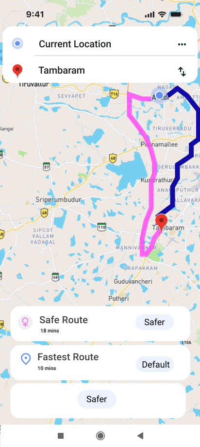
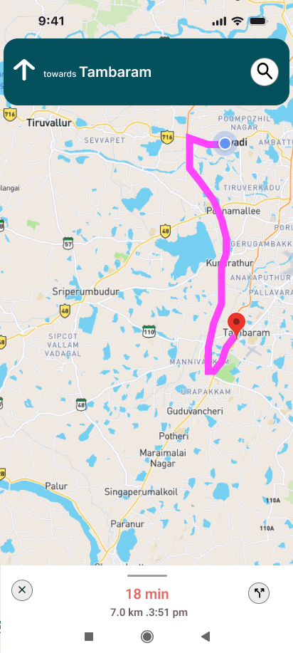
Designed the feature as a non-disruptive layer on existing Maps UI: a "Safe Route" toggle in the route options panel, colour-coded route lines (standard/safe), and a Safety Score badge on each route option.
05
Prototype — Test with Target Users
Built an interactive Figma prototype. Tested with 6 women who regularly walk alone. All 6 said they would use the feature; 4 said it would change how they currently plan routes at night.
Phase 5: Final UI Screens
High-Fidelity Interface
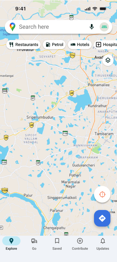
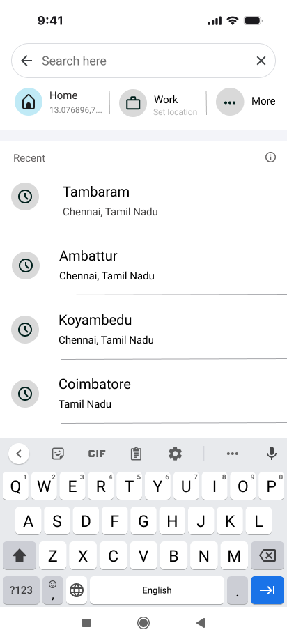
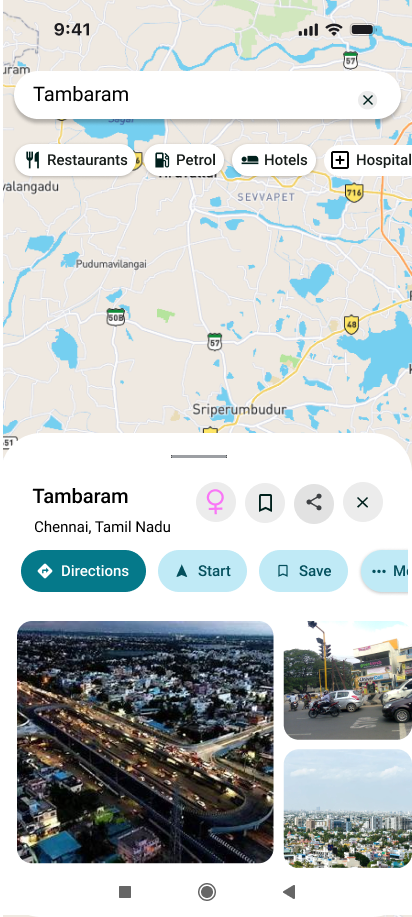
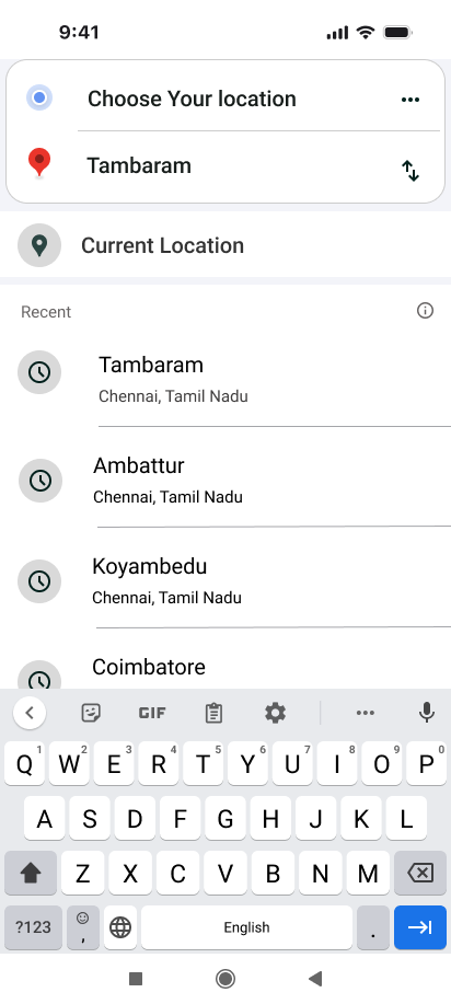
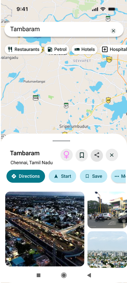
Designed as a seamless expansion of the Google Maps ecosystem, the interface preserves the familiar navigation language while surfacing contextual safety-first controls. Lighting data, pedestrian activity levels, and crowdsourced reporting are cleanly structured to empower quick, stress-free route changes at night.
Phase 6: Full Redesign
Legacy vs. Safe Route Dashboard
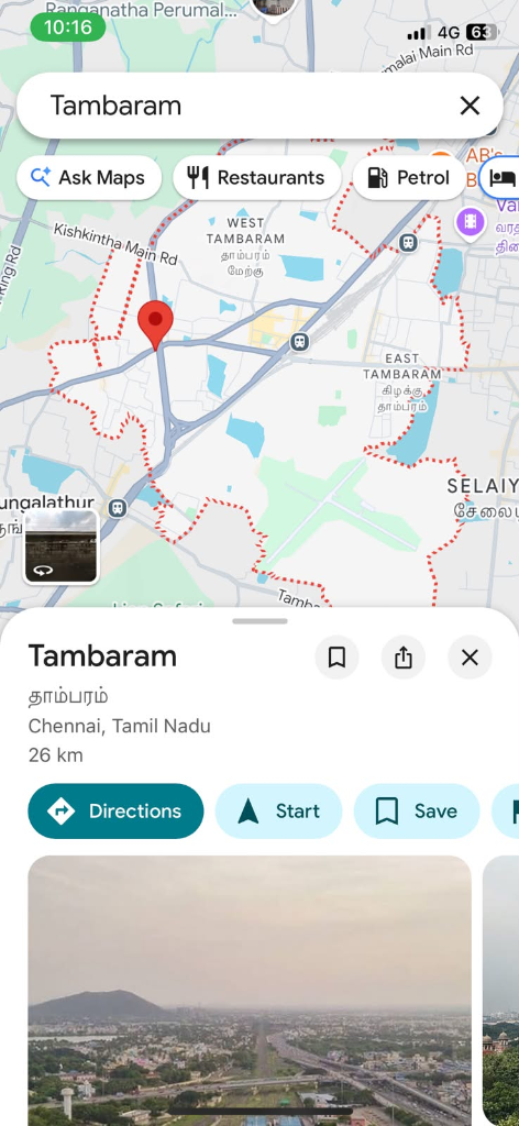
To demonstrate the functional utility of our Safe Route redesign, we placed the legacy navigation dashboard side-by-side with our newly integrated safety interface:
❌ Blind to Safety Parameters
The original navigation interface only optimizes for travel speed or distance, leading to key user experience oversights at night:
1
Blind to lighting conditions: Suggests dark, deserted alleys if they save 1–2 minutes of travel time.
2
No crowdsourced safety alerts: Fails to warn users of isolated streets or areas with high street-level anxiety.
✅ Contextual Safety & Illumination Overlay
The redesigned screen dynamically overlays real-world safety parameters directly onto route selection cards:
1
Safety Rating & Illumination Badges: Highlights open businesses, crowded walkways, and light quality directly on route summaries.
2
One-Tap Mode Toggle: Surfaces an easily reachable Safe Route Mode parameter toggle right before starting active navigation.
Feature Design
Key Design Decisions
🛡 Safety Toggle
Opt-In Contextual
Safe Route Mode is an opt-in toggle — it doesn't change the default experience. Appears contextually when navigation is started after sunset, gently surfacing it when most relevant.
📊 Safety Score
Transparent Scoring
Each route shows a Safety Score (1–10) with a brief breakdown: "Well-lit street · Moderate crowd · 3 open businesses nearby." Transparency builds trust in the feature.
🎨 Visual Encoding
Colour-Coded Routes
Safe routes display with a distinct colour on the map (teal/blue vs standard grey). Users can visually distinguish the safest path at a glance without reading any text.
🔔 Safety Alerts
Turn-by-Turn Safety
Optional: subtle in-route notifications highlight well-lit sections ahead or suggest staying on the main road when a shortcut would reduce safety score below threshold.
Outcome
Impact & Learnings
Confidence Over Speed
The feature reframes navigation from a time-optimisation problem to a wellbeing-optimisation problem. 100% of test users said they felt more confident about night navigation with the feature. The key insight: sometimes the best UX is adding the right constraint, not removing all constraints.
💡 Key Learning
Design for Context
The same user has different needs at 2pm vs 11pm. Context-aware design — surfacing features at the right moment — is more impactful than always-on features.
🔧 Tools Used
Figma + Research
Figma for wireframes and interactive prototype. Secondary research on urban safety data. Design principles: Contextual Design, Progressive Disclosure, Inclusive Design.