The Challenge
Google Pay has revolutionized how we make everyday transactions. However, as the application expands its service offerings, its interface often becomes cluttered, creating friction for basic tasks.
This case study documents the end-to-end design process of introducing the QuickPay Favorites feature as an opt-in addition to Google Pay. The goal was to optimize transaction speed for users who pay the same local merchants (grocery shops, tea stalls, campus cafeterias) or friends daily, eliminating the repetitive need to scan QR codes or search contacts.
User Research & Insights
To understand checkout friction, we conducted a rigorous discovery phase. We surveyed 25 regular Google Pay users and conducted 5 in-depth user interviews to map their spending behaviors and checkout pain points. The results revealed a compelling pattern of highly repetitive behavior:
Defining the Gap
Through systematic observation, we discovered that convenience store checkouts frequently stall because of payment app friction. Returning customers scanning the same merchant QR codes repeatedly is a highly inefficient loop.
Our problem analysis showed that users must navigate a minimum of 4 to 5 friction-heavy steps for every single transaction:
Empathy & Persona Mapping
Synthesizing our research findings, we constructed a comprehensive Empathy Map to outline the cognitive and emotional states of our primary target audience. This blueprint directly informed our persona construction:
- "I pay the same tea stall guy every morning, why can't I just tap a button?"
- "It's embarrassing when the scanner fails and people wait behind me."
- "This scanner is taking too long to focus."
- "I wish I could split bills with my friends without digging through history logs."
- Scans the same physical QR code at least 2–3 times a day.
- Frequently abandons scans to look up contact numbers manually.
- Anxiety and pressure when lines form behind them at checkout.
- Frustration at slow camera loading times and QR scanning overhead.
This empathy mapping culminated in our primary persona, Rahul, representing the typical micro-transaction user:
Needs & Goals
Rahul makes multiple small micro-transactions daily at the campus cafeteria and local food trucks. He wants a payment method that is fast enough to keep him moving between classes.
Pain Points
- Struggling to scan cafeteria QR codes during crowded lunch hours.
- Hates digging through long history logs to find a friend's contact to split bills.
- Feels pressure from people waiting behind him in queues.
User Journey & Optimized Flow
We mapped Rahul's emotional and behavioral stages across a typical payment journey to pinpoint exactly where friction spikes, then designed an optimized user flowchart to resolve it:
Rahul stands at the counter; reaches for phone. "I hope this pays quickly so I'm not late."
Friction: None. Opportunity: Offer home-screen shortcuts to bypass opening the app.
Launches app, taps "Scan", waits for camera. "Why is the camera taking so long to load?"
Friction: Camera lag, lighting issues. Opportunity: Bypass camera entirely for frequent payees.
Inputs PIN while feeling rushed by the queue. "Hurry up, people are staring."
Friction: Social anxiety, slow load. Opportunity: Pre-fill payment details to isolate the PIN entry.
By mapping this journey, we realized we could bypass the physical camera scan entirely for daily recurring transactions. The flowchart below contrasts the traditional scanning flow with our express QuickPay Favorites shortcut:
High-Fidelity Interface
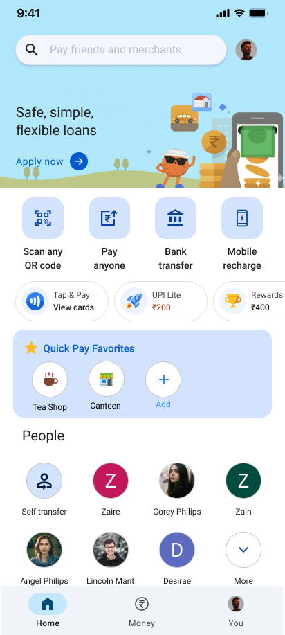
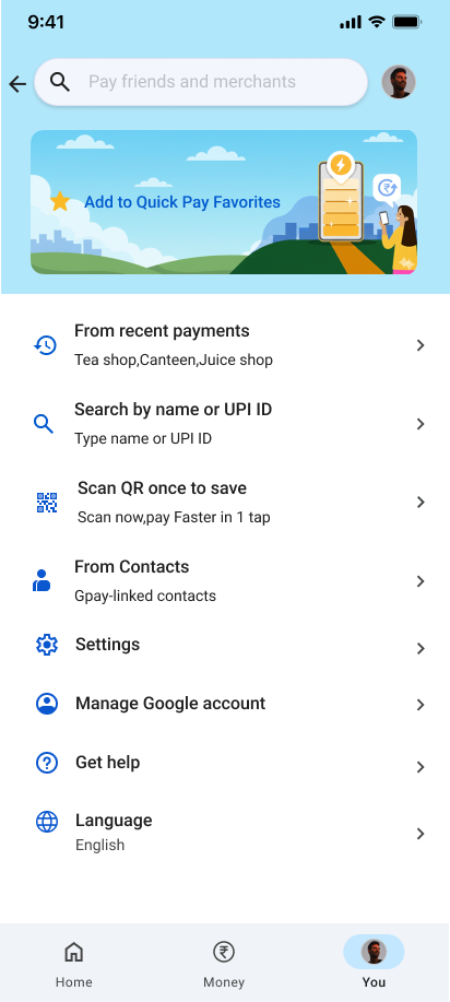
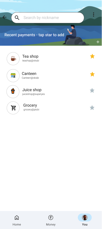
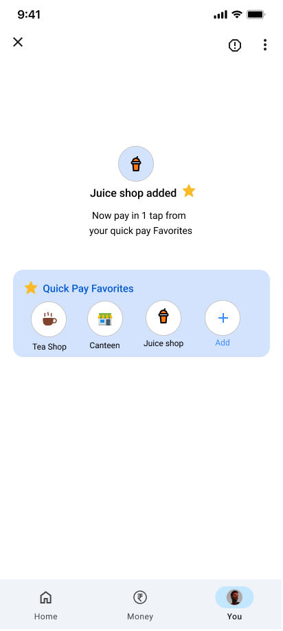
Building upon the structural wireframes, we developed a high-fidelity visual interface. The design leverages our cyberpunk-infused dark theme to establish an elegant, premium look and feel. Each screen is carefully crafted to minimize cognitive load, emphasizing speed and ease of interaction during high-pressure transaction moments.
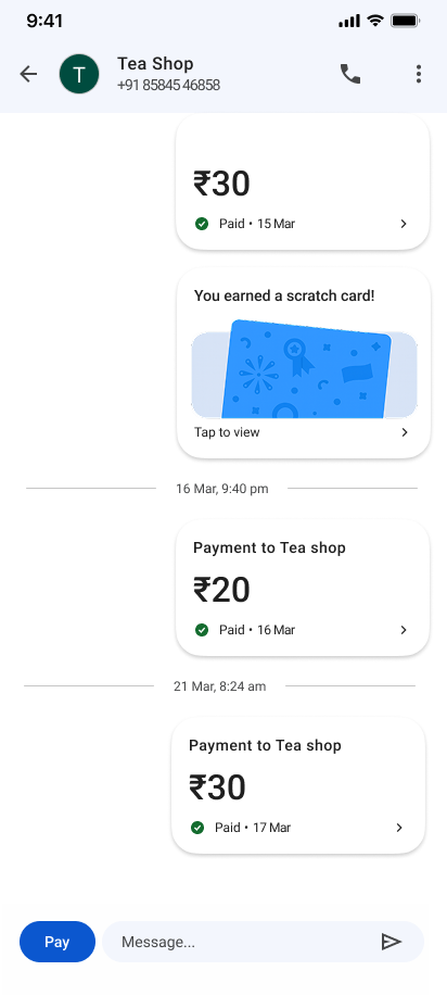
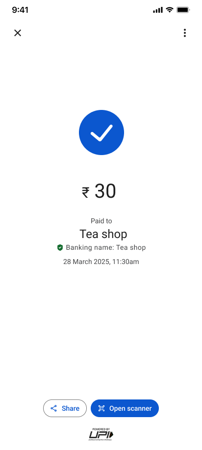
Legacy vs. Optimized Dashboard
To evaluate the structural gains of our redesign, we compared the existing legacy layout of Google Pay against our optimized dashboard. By placing them side-by-side at full resolution, we can trace how we minimized visual noise to construct an express pathway for daily payments:
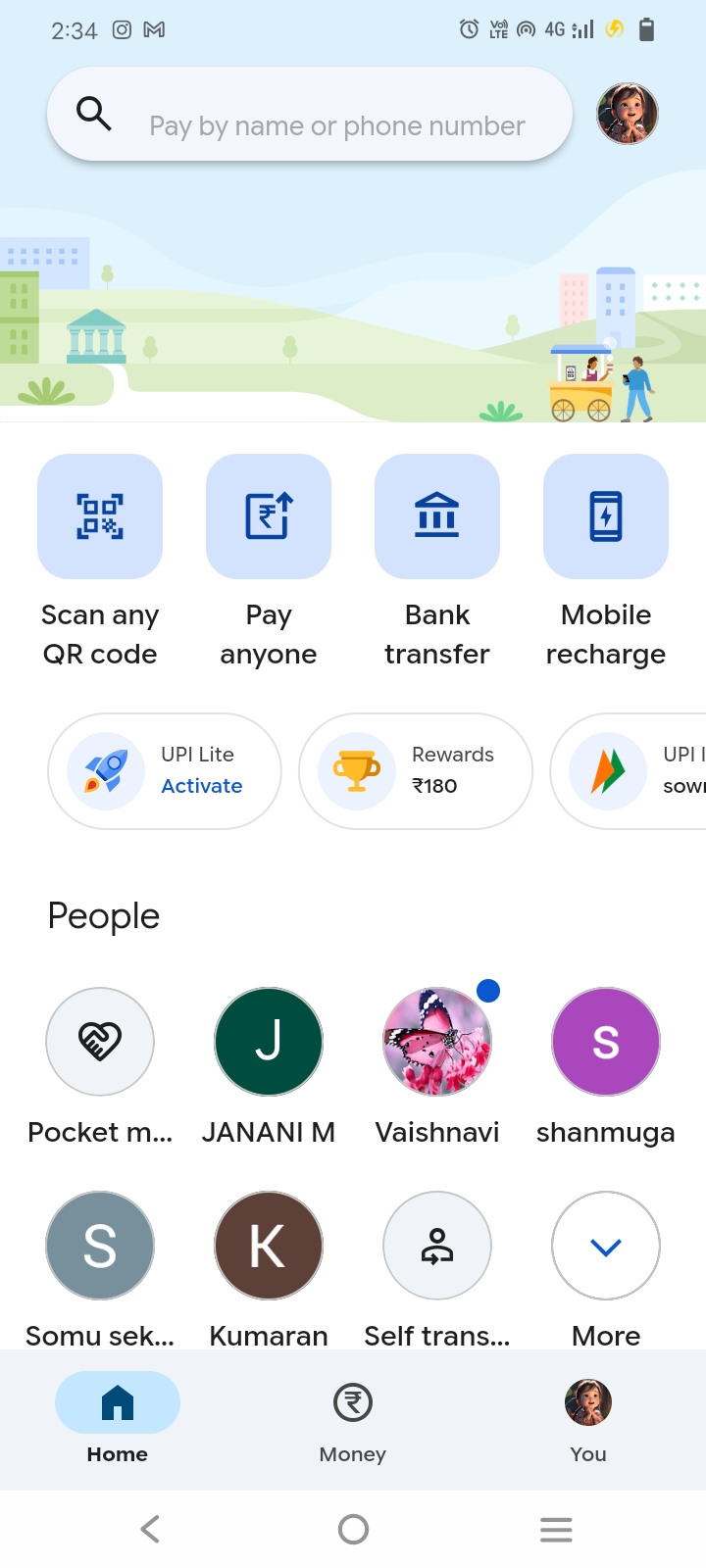
❌ Fragmented Home Layout
The original home layout had severe structural gaps that compromised transaction speeds for returning daily customers:
Buried QR scanner option: Requires opening the app and finding the scan icon, which adds visual scanning load.
No shortcuts for repeat payees: Users paying the same lunch merchant every single day are treated as first-time transactions every time.
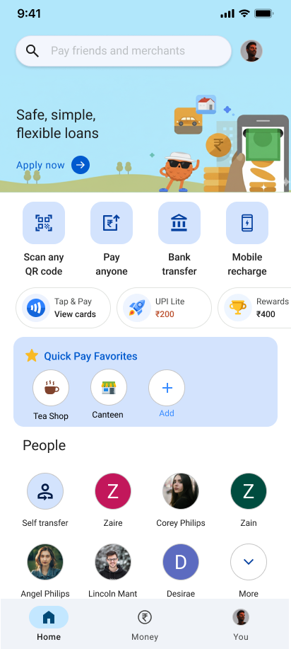
✅ Sleek Favorites Widget Integration
The redesigned interface introduces a specialized Favorites row that optimizes mobile ergonomics and eliminates scanning steps entirely:
One-Tap Shortcut Bar: The QuickPay widget pins frequent payees directly under balance cards, placing them perfectly within thumb reach.
Express Bypass System: Tapping a profile immediately skips camera and QR scans, dropping Rahul straight onto the secure amount panel.
Validation & Testing
We tested the high-fidelity interactive prototype with 5 users in realistic environments (high ambient noise, simulated checkout hurry). Testing revealed two critical details:
1. Discovery of the "Add to Favorites" Option: In the first iteration, users had to go deep into settings to add a favorite. They struggled to set up their dashboard initially.
The Iteration: We introduced a contextual "Add to Favorites" toggle directly on the successful payment confirmation screen. If the app detects you have paid a merchant multiple times, a micro-interaction prompts you to pin them to your home screen widget.
2. Security vs Speed: Users were worried that accidental taps on home screen shortcuts might trigger instant money transfers.
The Iteration: We kept standard security measures intact. The widget only shortcuts the scan/contact selection stage; entering the PIN is still mandatory to confirm any financial transfer.
Impact & Learnings
Confidence Over Speed
The final design successfully resolved the core problems of speed, anxiety, and camera dependency. It demonstrated the value of micro-optimization in massive utility apps.